Note: Names and logos have been changed for privacy reasons
Tidy is the workforce management app that prides itself on solving complex problems in the most simple way possible. Tidy’s solutions help cleaning businesses manage multiple workers, sites, and operations, from anywhere, at any time.
The Problem
Tidy was about to embark on a major pivot from recruitment management to workforce management in the commercial cleaning industry. Tidy was originally branded TalentFinder and resided in a completely different industry. While they both shared similar problems of time and attendance, TalentFinder was no longer suitable and required a complete rebrand and rebuild.
The Solution
The product team went through two major workshops to create two important peices of the puzzle. The first. A name. The second. A visual brand. The naming workshop used fundamentals from Brad Flowers’s [Bullhorn Creative] book aptly named The Naming Book. The workshop consisted of 5 steps:
- Criteria and concrete statements
- Generate ideas
- Pick a top 3, run market feedback research
- Run feasibility
- Decide
The second set of workshops was all about the visual brand. These consisted of 5 steps:
- Moodboard, generate ideas
- Competitor landscape research
- Define goals
- Stakeholder buy-in
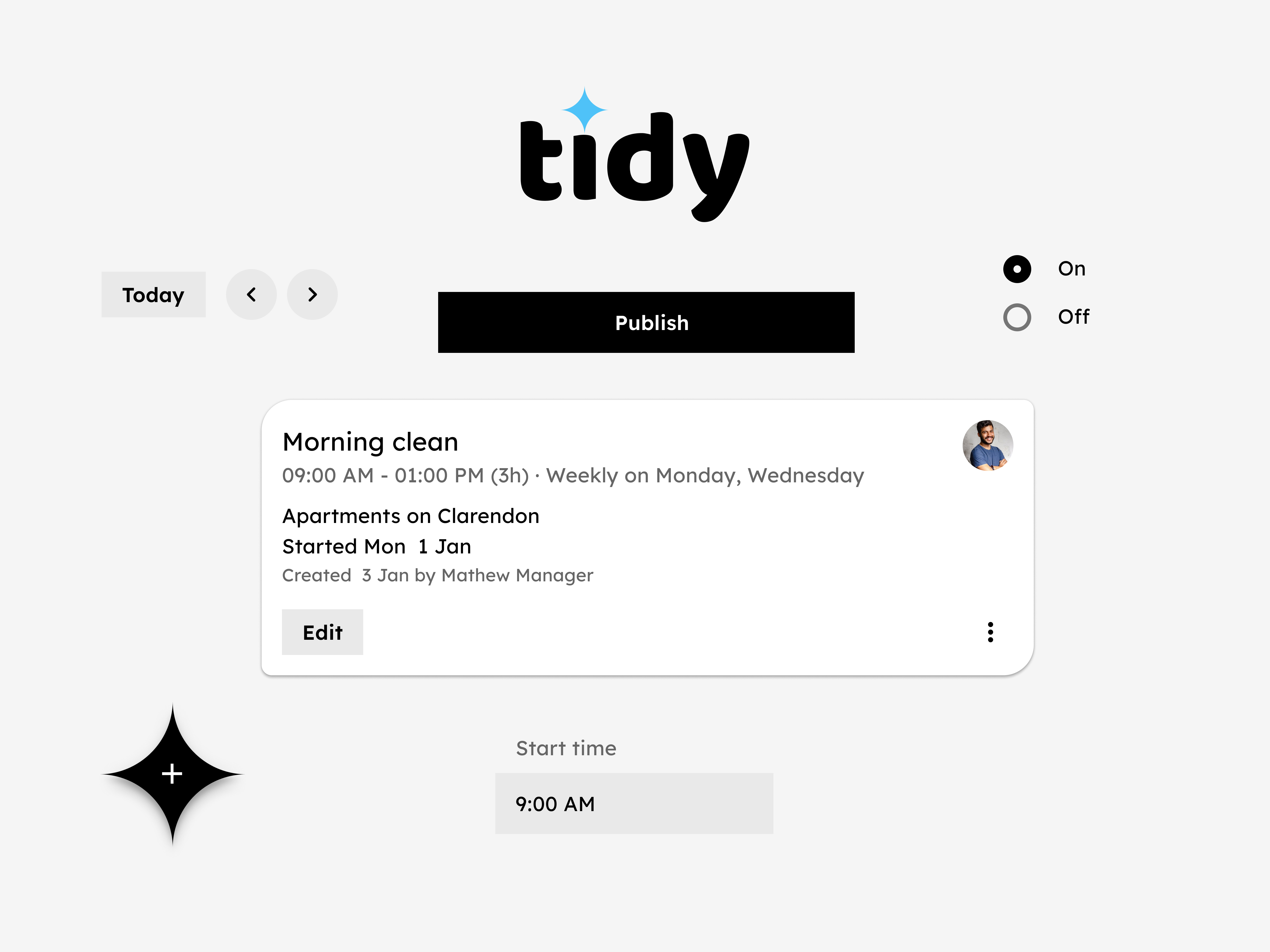
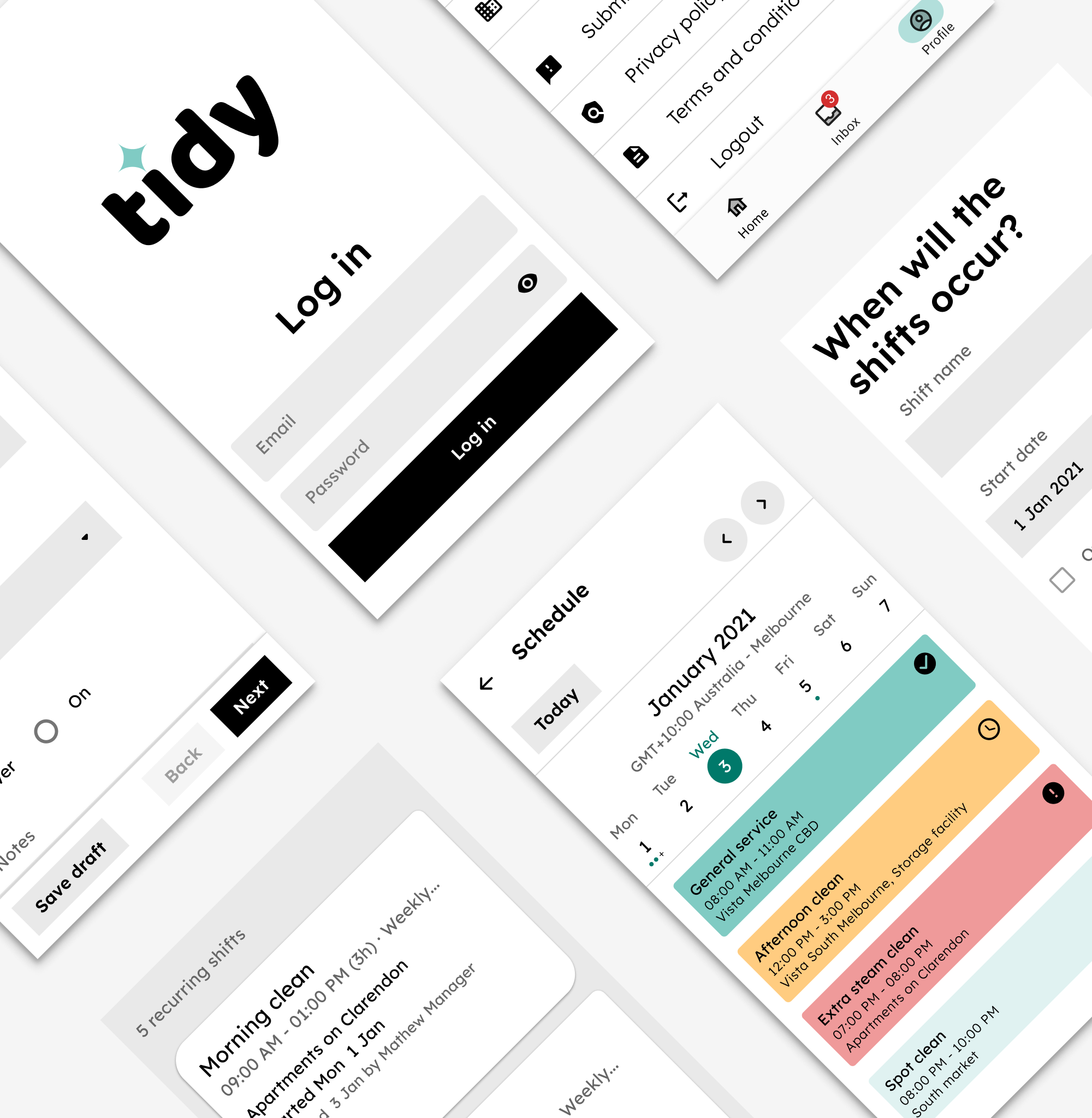
Tidy is workforce management software that uses design to create an on-brand experience with a data-driven aesthetic.
Minimal aesthetic
Tidy uses a minimalist aesthetic, creating an experience where content and actions take the forefront of the user experience.
Tidy enables businesses to manage their own desk-less employees with ease. Their employees get an awesome app for accessing and documenting everything on their phone, such as shift management, proof of location (digital certificates), task checklists, and much more.
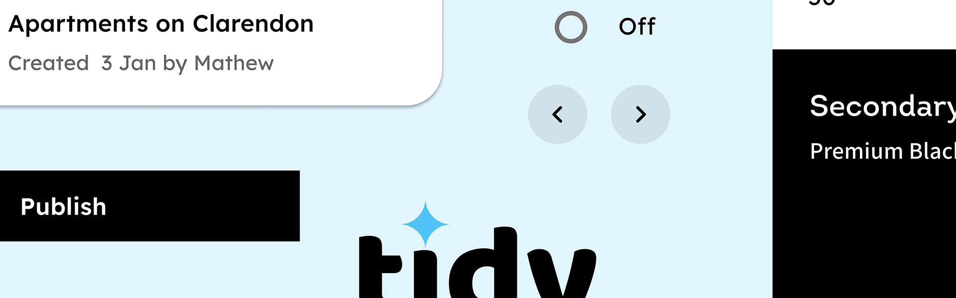
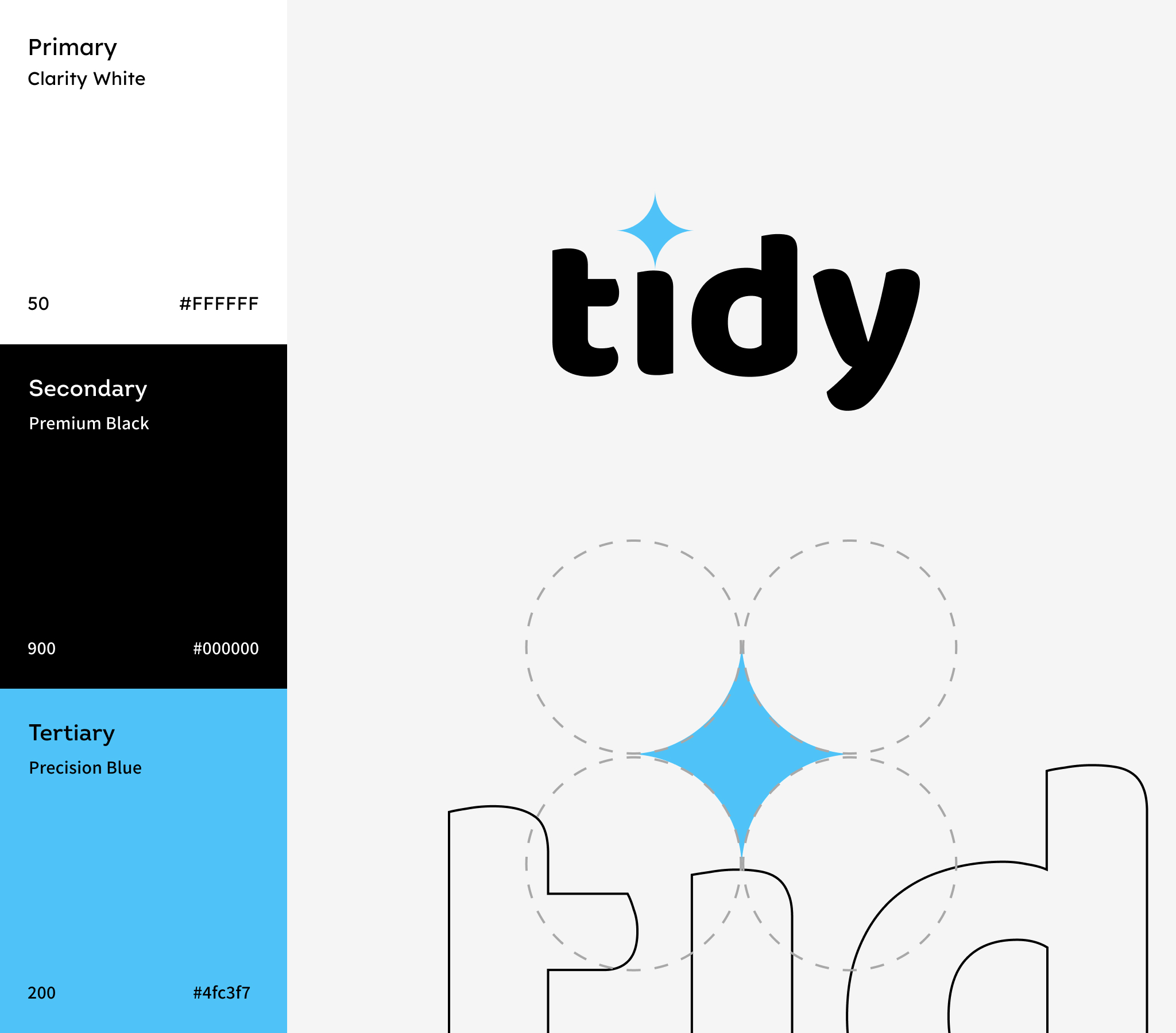
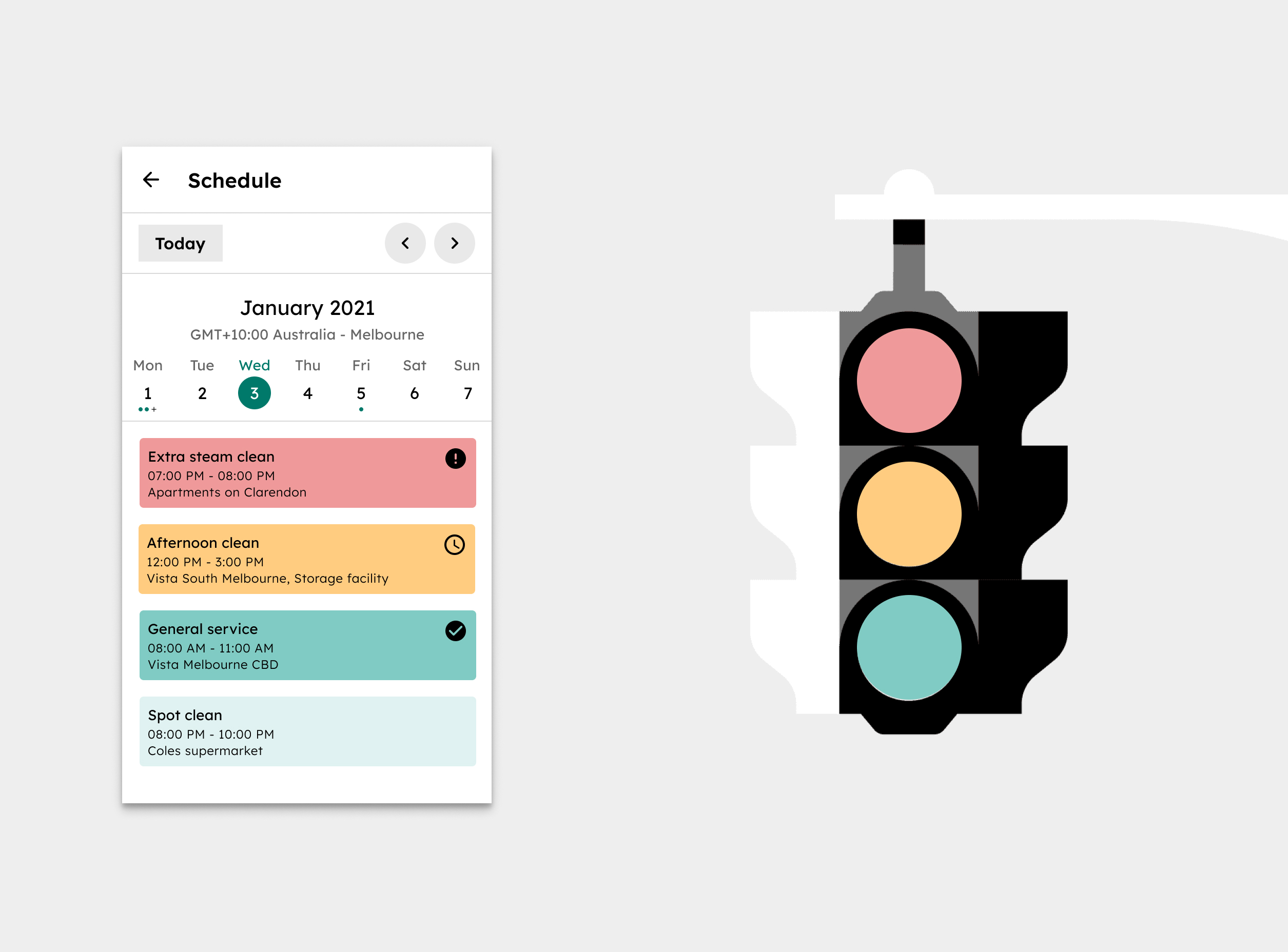
Tidy Primary White symbolises clarity and freshness while Secondary Black gives Tidy a premium feel. The high contrast between data and the background colour make it easy to read component statuses, graphs and charts.
Visual themes
The Tidy sparkle is the visual theme in the Tidy app, and is used on various components and elements. They reflect the negative space sparkle in the logo, and act as an extension of the Tidy brand.

Product architecture
Tidy information architecture has a hierarchical structure, allowing users to look at operational data through a variety of categories. The dashboard overview provides the most general version of this category, with an individual shift being the most detailed category in the structure.
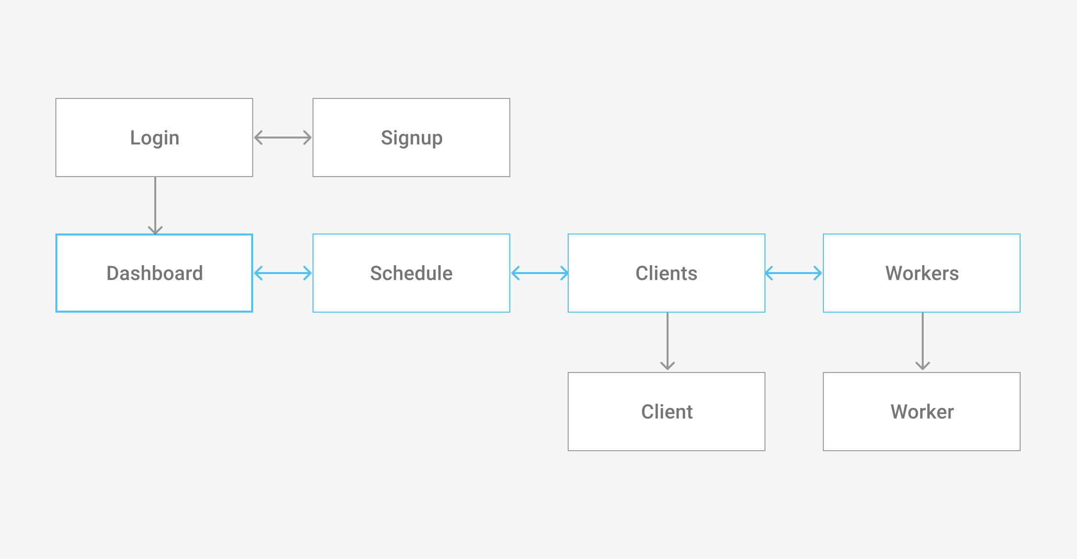
Content
Content is divided into sections related to workforce operations, such as schedule, attendance, and inspections. Tidy’s dashboard operates as a hub to these sections.
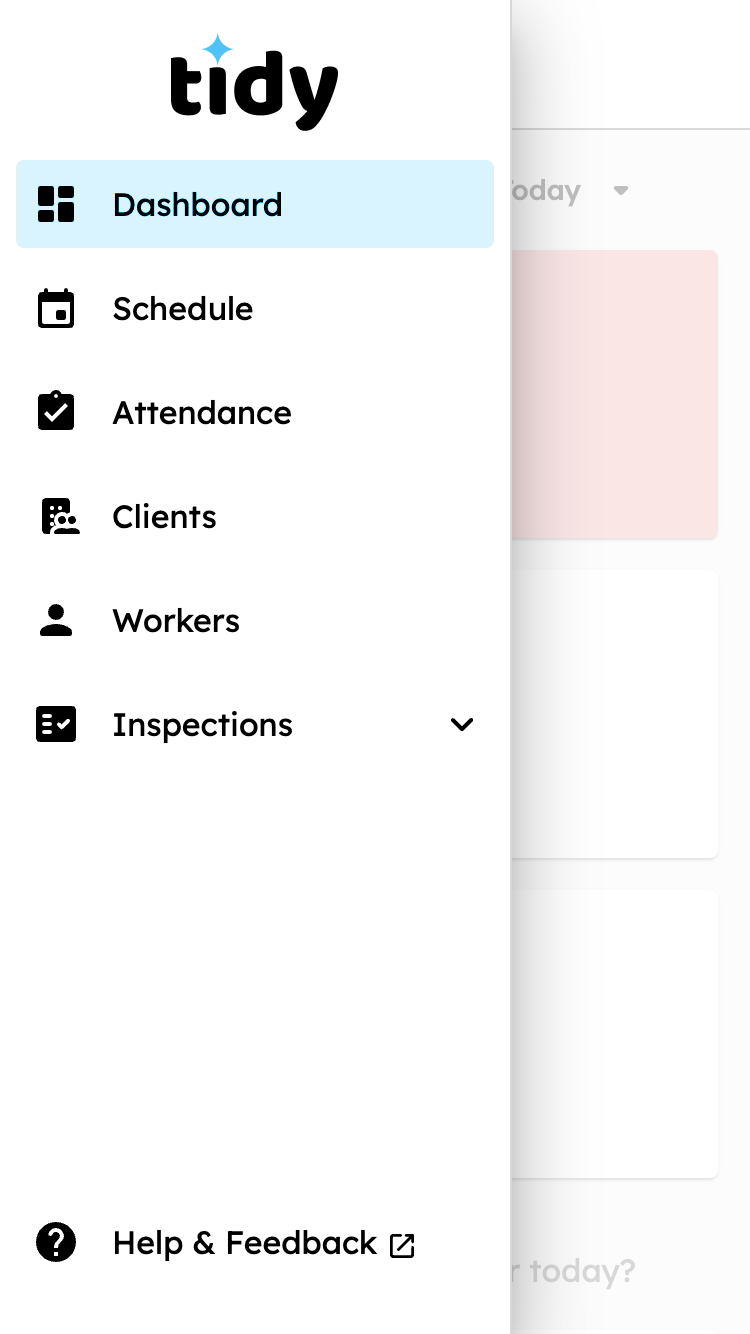
Navigation
On desktop and tablet, Tidy uses permanent drawer navigation. On mobile, temporary navigtation is used to optimise content realestate.
Tidy navigation provides a permanent region to navigate between sections, while taking up little screen space.
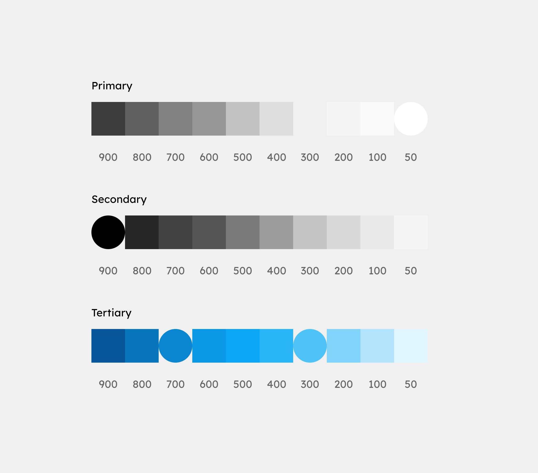
Colour
Tidy’s primary color is clarity white. It uses a grayscale color palette so that operational traffic light colours stand out and copy is easy to read without distraction.
Colour theme
Meaning
Colour can communicate the meaning of different UI elements. Tidy’s traffic colours clearly communicate red = something’s wrong, amber = be cautious, and green = positive vibes, nothing to worry about.
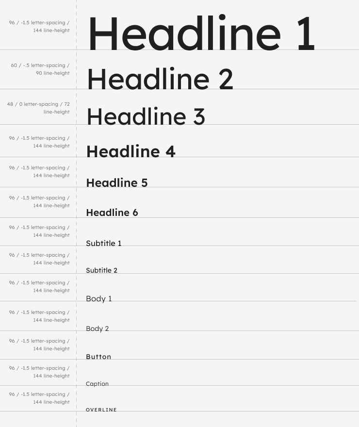
Typography
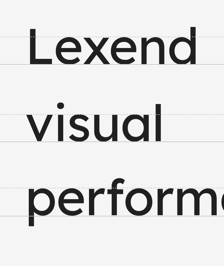
Lexend fonts are intended to reduce visual stress and so improve reading performance.
Iconography
Tidy uses Material Design’s rounded iconography to express the brand while focusing on icon recognition and functionality. Icon and text thickness grades are matched for a harmonious visual effect.
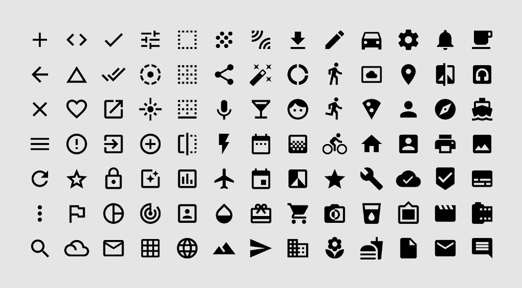
- Style: Rounded
- Fill: 1
- Weight: 700
- Grade: 200
- Optical size: 24px
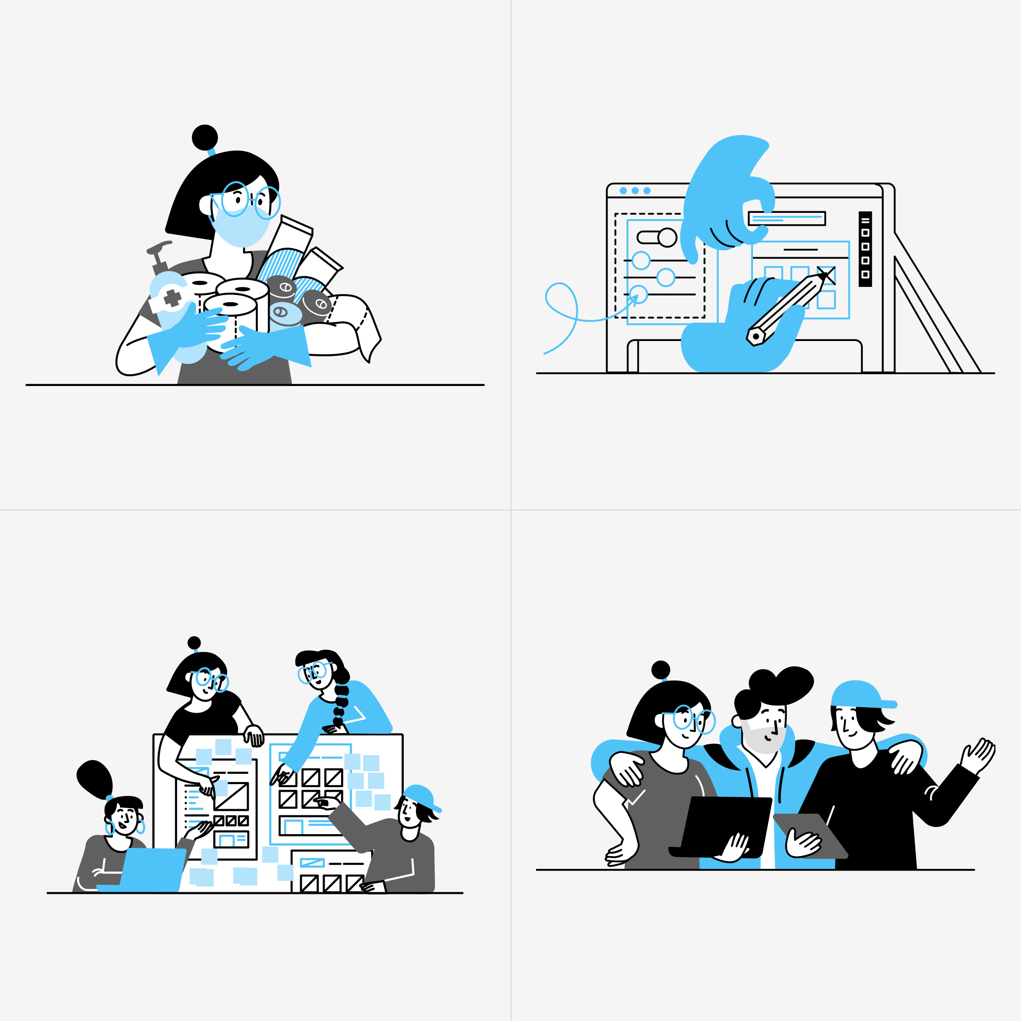
Illustrations
Tidy’s aesthetic puts focus on content by using a grayscale color palette to allow illustrations to stand out.