Ticket Tournament is a knock-out game of survival for Sport and Racing that offers a mix of luck, strategy, and big prizes
What are we trying to solve?
Ticket Tournament saw an oppurtunity to capitalise in a growing market for alternatives to traditional lotto and betting. Many Australians play gamified products like footy tipping and supercoach while also placing the occasional bet and buying lotto tickets. Using a combination of these popular products, Ticket Tournament sought to invent a new style of game to enter the market. Think footy tipping meets lottoland meets reverse raffles.
Discovery & Research
conducted by Ticket Tournament
User Research
User Research was lead by Ticket Tournament. They used a combination of data from an existing product pivot, competitive analysis, and field testing in hotels and pubs using printed materials.
Synthesise Research & Design Strategy
Synthesizing Research
Through User Research, we found these key insights to move forward in the right direction.
- Users enjoyed games like footy tipping and lotto because they were simple and didn't require much involvement
- Features like a leaderboard help with game competition
- Games played in a real world space which is the feature of the night, ie; Reverse Raffle, may be hard to translate into the digital space
- Holding and selling at the right time, like the stock market, can be the skillful part of a game
- Not showing upfront the actual chance of winning helps to sell tickets
Personas
Unfortunately the client had outlined over 8 personas they wanted to cover, so we had to do our best sticking to the ones we thought were most important.
Primary Persona: The Lotto player. Someone who wants to spend minimal time whilst having fun. They love the thrill of winning big prizes. They are interested in Sports and have played traditional Footy Tipping.
Secondary Persona: The Casual Punter. They don’t mind spending more time finding value and having a bet on Racing and Sports. Aspects of there habbits will need the convenience of a Power user.
Feature Prioritization (MVP)
While many features were discussed like trading, bidding, liking, we had to help steer the clients from turning the product into the next Facebook or Twitter with chat and hashtags. Finally, we established a minimal set of features that would meet the budget and users needs.
The list included the following features
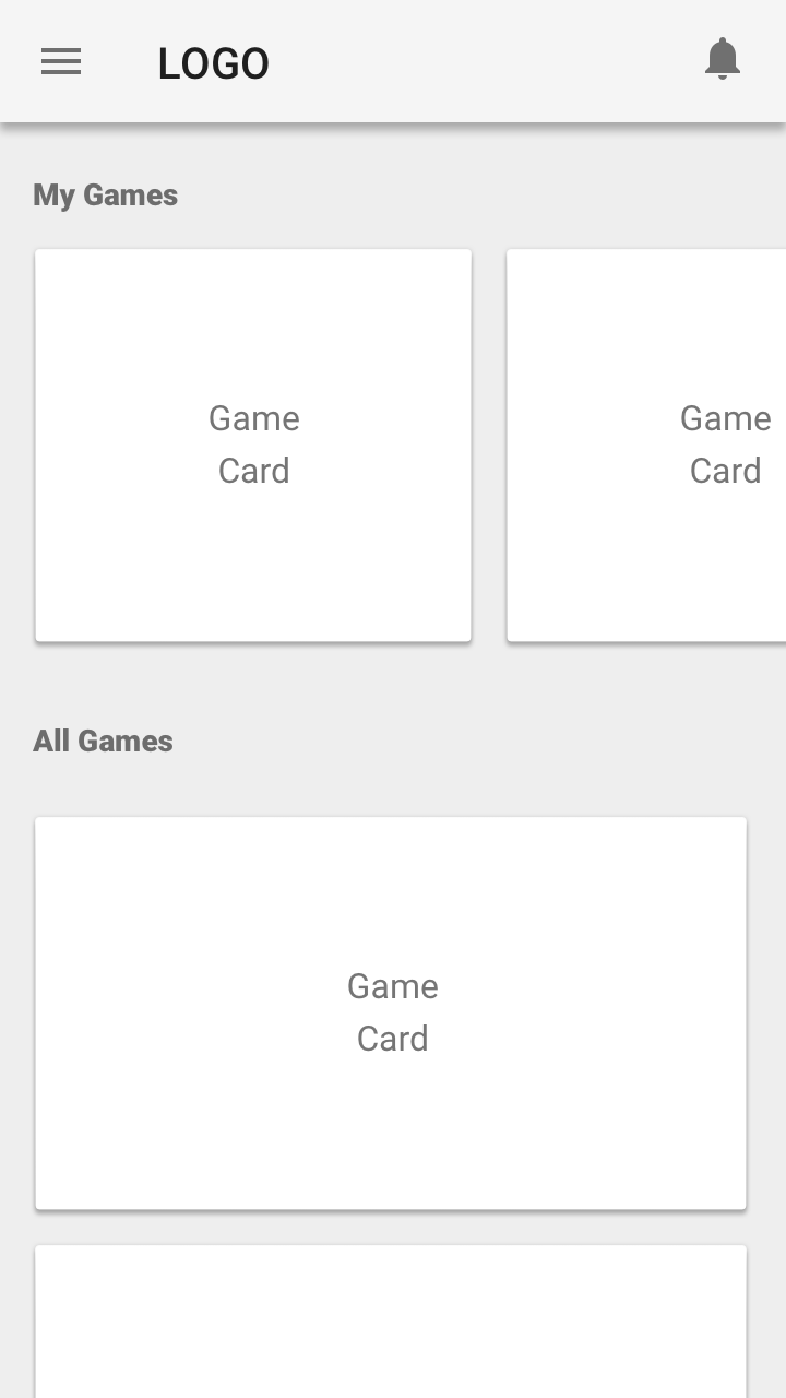
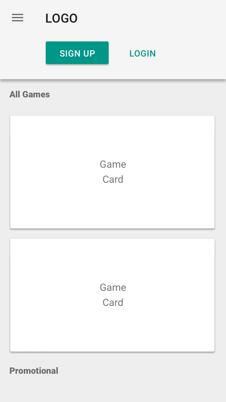
- Display a list of public games
- Signup, Authenticate, Password Recovery
- Display a list of games entered
- Display Tickets
- Buy tickets
- Display a list of purchased tickets
- Leaderboard
- Chance of going into the next round
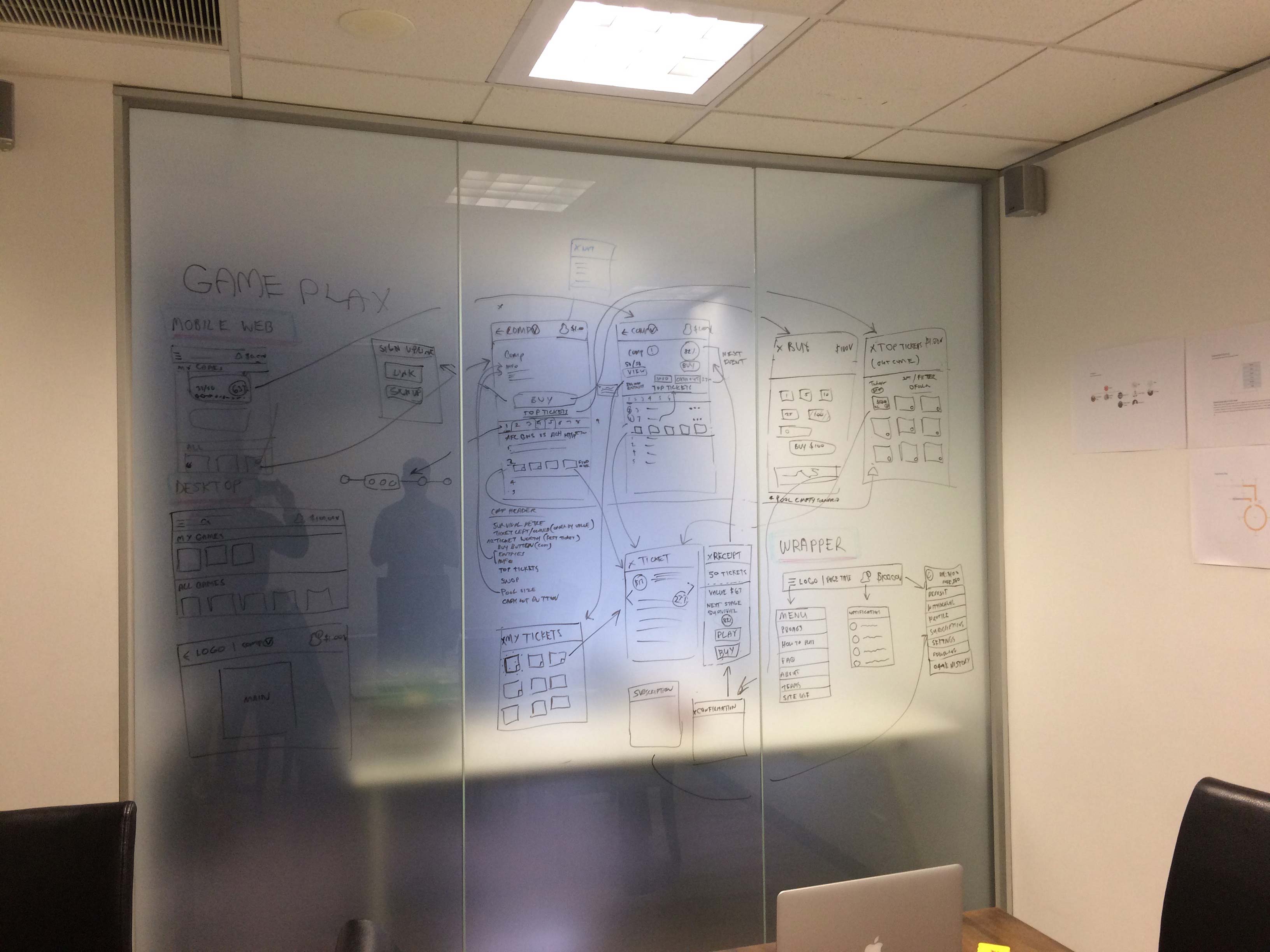
Placement & Layout Design
Sketching and Testing
Gameplay testing was captured during field testing in hotels and pubs using printed materials.
The Task
The task was to complete five games of ten rounds with 20 players. This field test was Conducted by Ticket Tournament. It’s very hard to simulate this type of gameplay with a one dimensional paper prototype. Luckily, Ticket Tournament translated well to a manual paper format. The games were conducted over a month with a note taker and selected user interviews during and post games.
The Results
The key insights that were passed to us were:
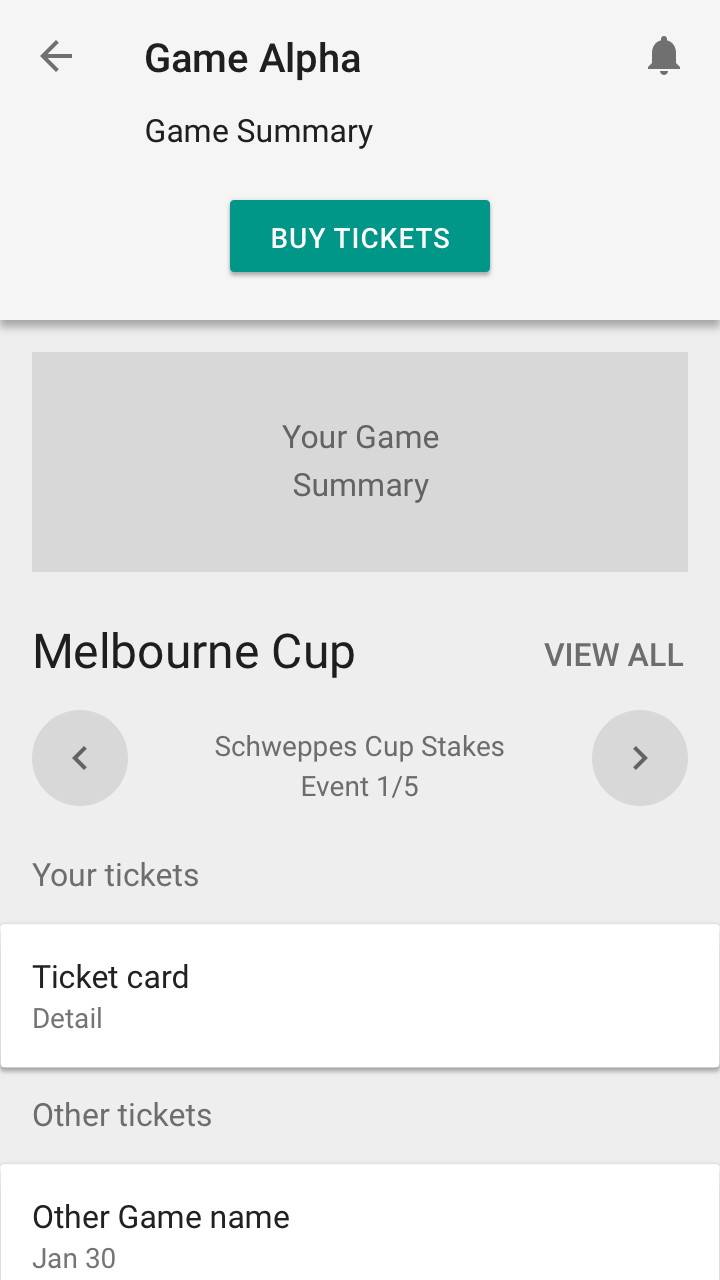
- Users are not that interested in future events, they are mostly interested in current, past and next.
- Being a round by round based game, users wanted to know about the chance to move onto the next round
Based on these insights, we altered our Sketch flows of the User Interface.
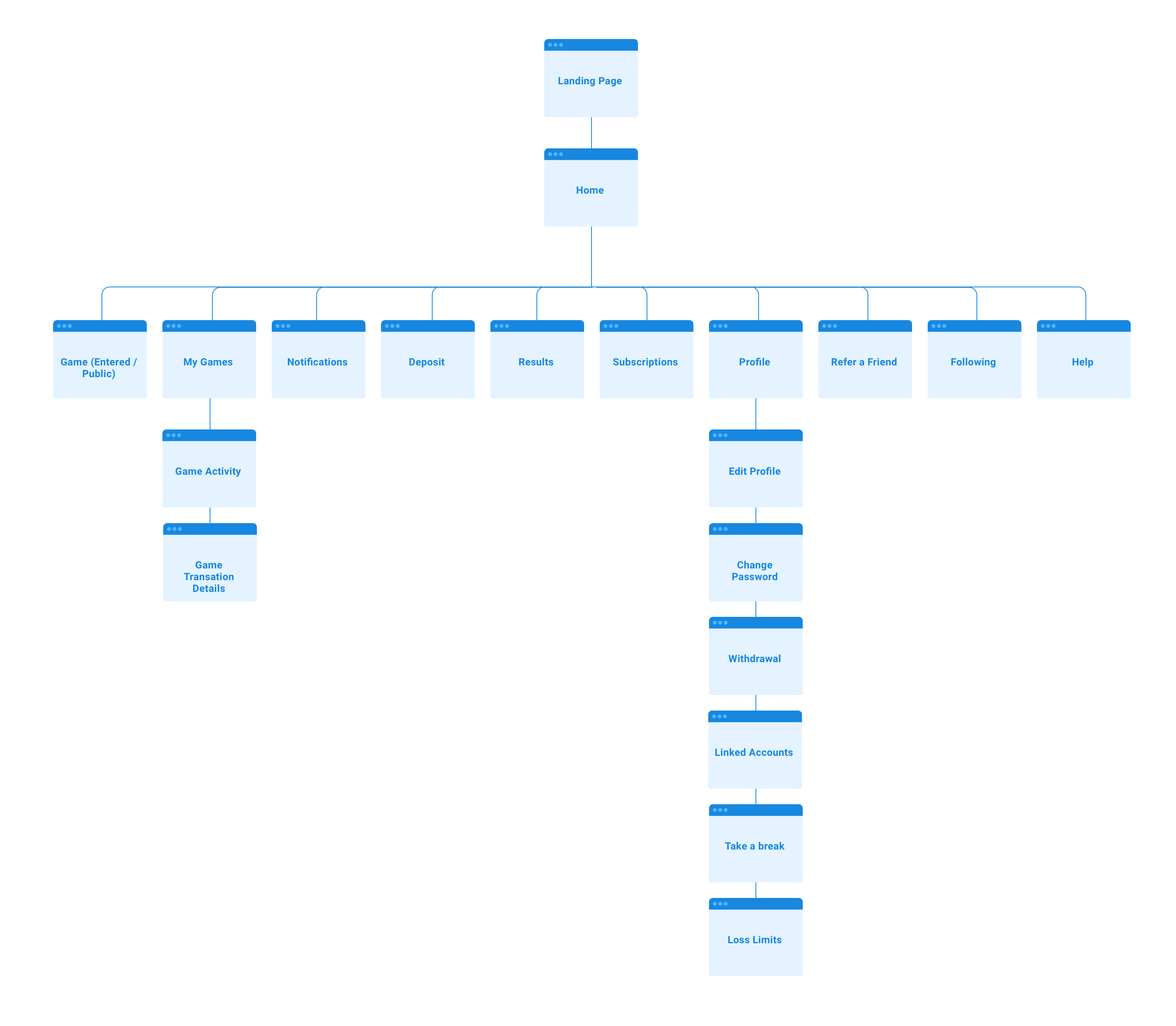
Information Architecture
Navigation
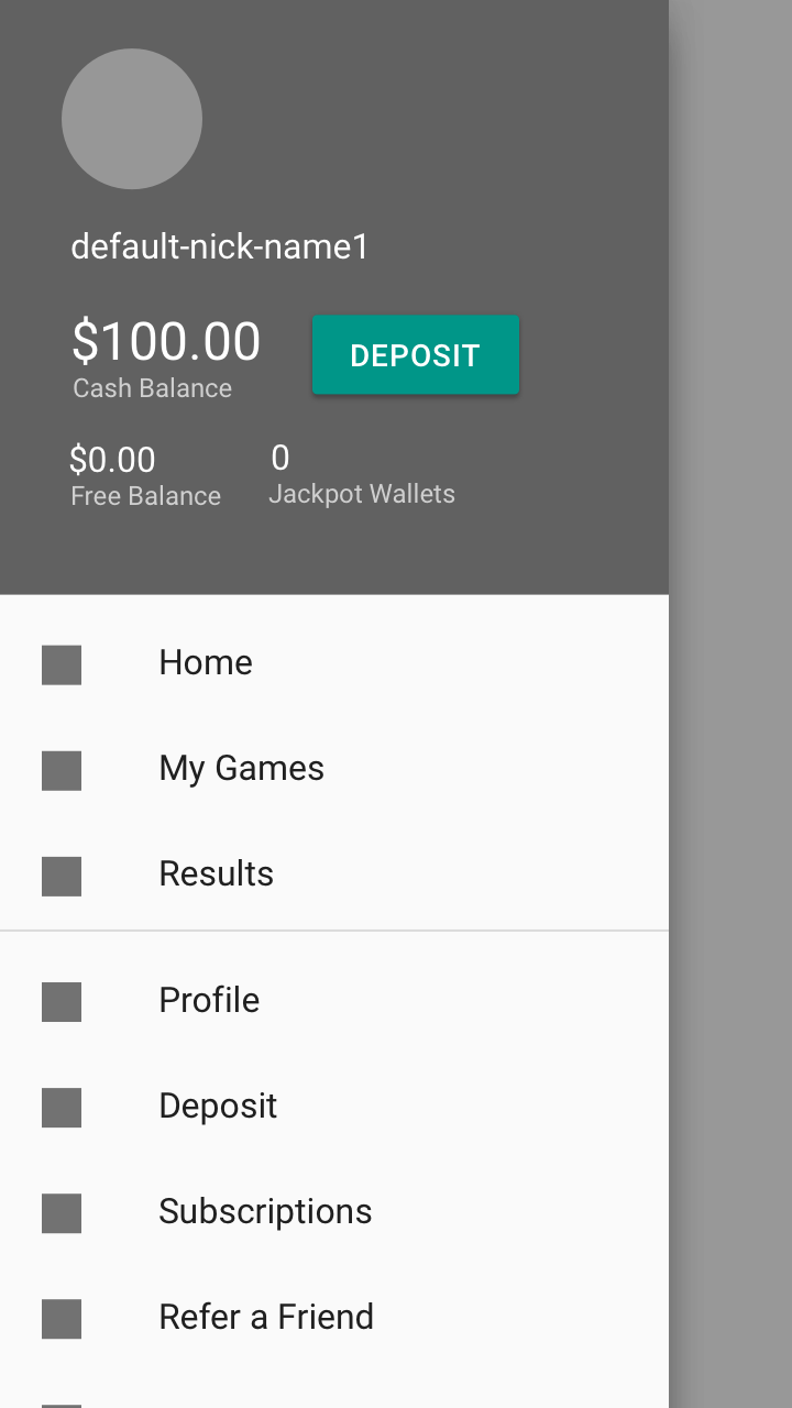
The main path of the product is all lead from home. This consists of entering games, and accessing games you've entered.
So with this in mind, we mainly used local navigation, but kept notifications in the header of most top level pages.
Until we have more information about how users will access notifications, we just played it safe. I haven’t identified many pages that need to be accessed globally and quickly so there is no need for some type of global bottom nav bar.
Sitemap
Execution
Platform
With a limited budget, we suggested that a responsive website with App Wrappers (for Push notifications) was going to be the most cost effective solution to build and maintain the miniaml viable product. When allocating hours for the build, there was not going to be alot of time for interaction design, so we wouldn’t’ be able to utilise nice App transitions.
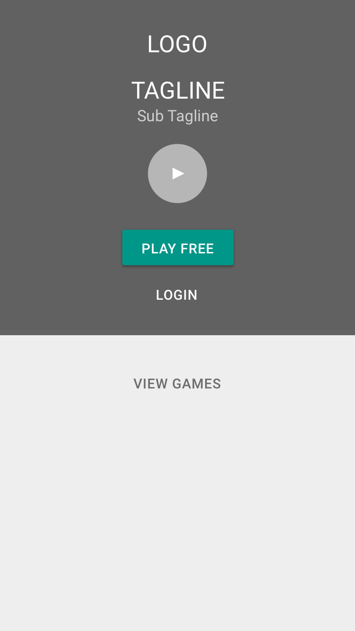
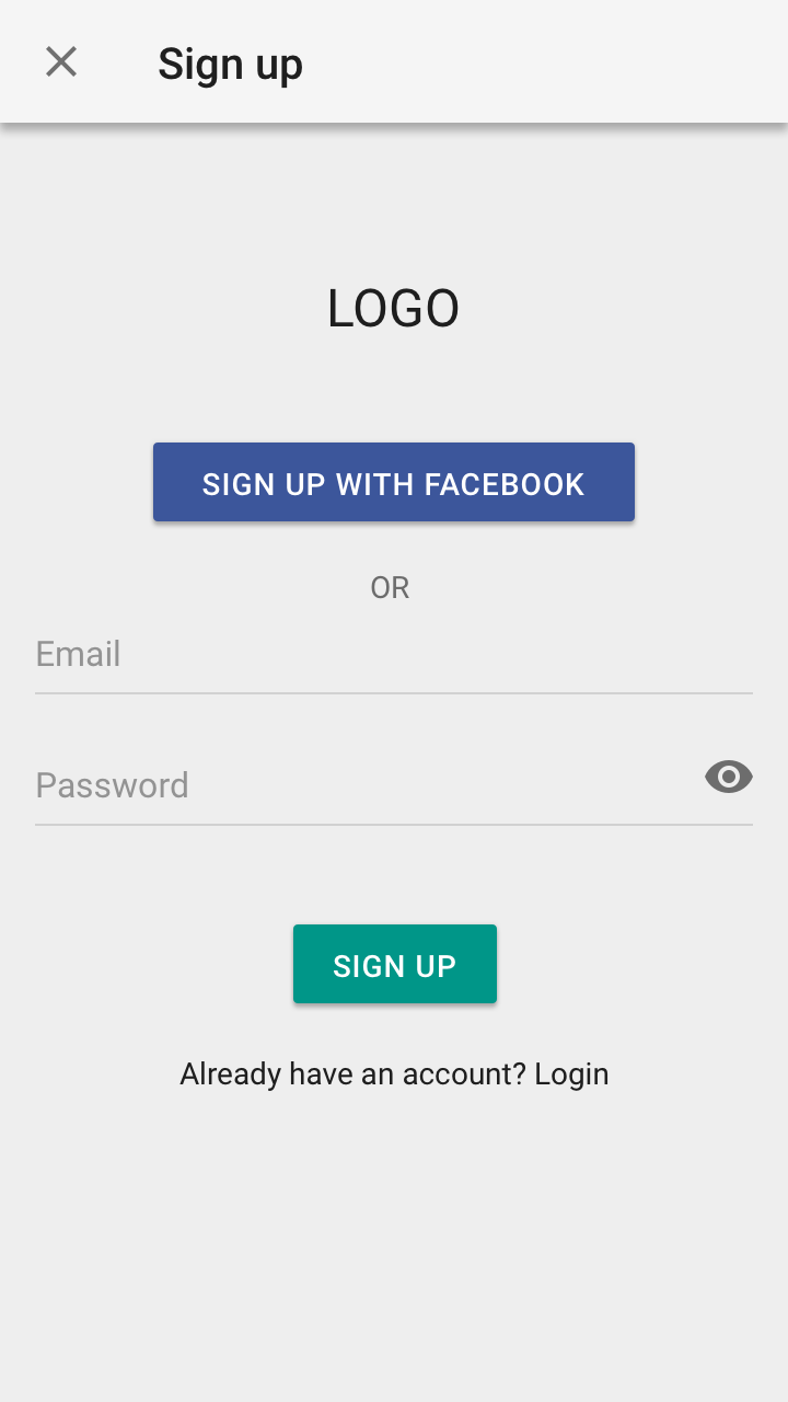
Wireframes
The primary persona of ‘The Lotto Player’ is a casual player who may buy one ticket every few weeks. We made sure to keep this the focus and not complicate the screen or have to many sneaky slick features that would require on-boarding that may be forgotten. We needed this to be intuitive and fun.
For any advanced features of the secondary persona, ‘The Punter’, we made sure to kept these behind a second click so we could keep the interface clean. Some of these features included searching by outcome and cashing out.
Med Fi
Hi Fi
We come up with a few neat component metaphors but most of the Visual Design was lead by Ticket Tournament. They used a combination of flat and skeuomorphism design. Here were a few of my designs.
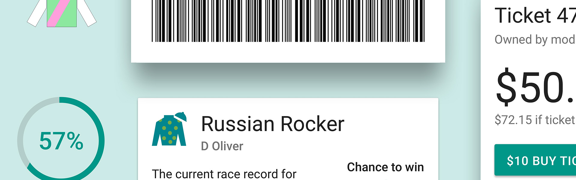
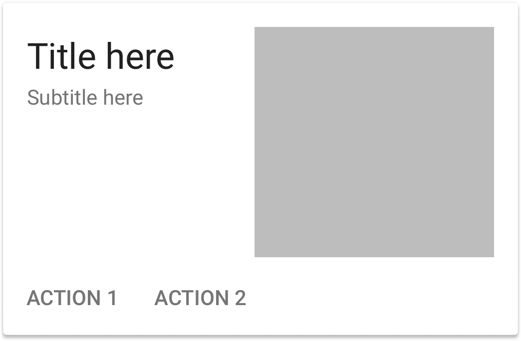
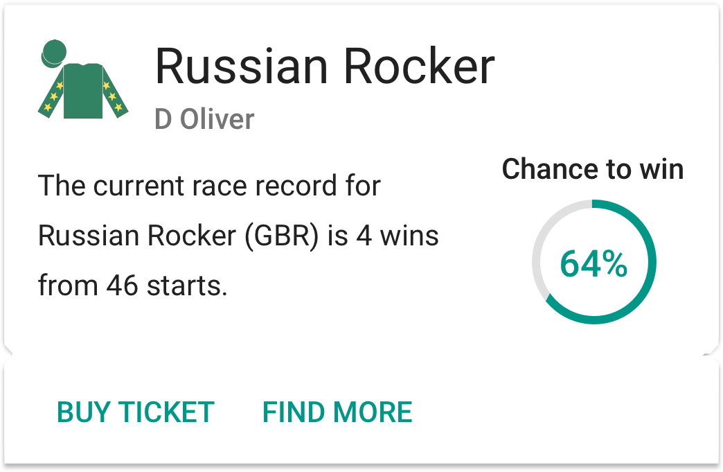
Cards
We turned the humble Card into a Ticket to help with the visualisation of the game.
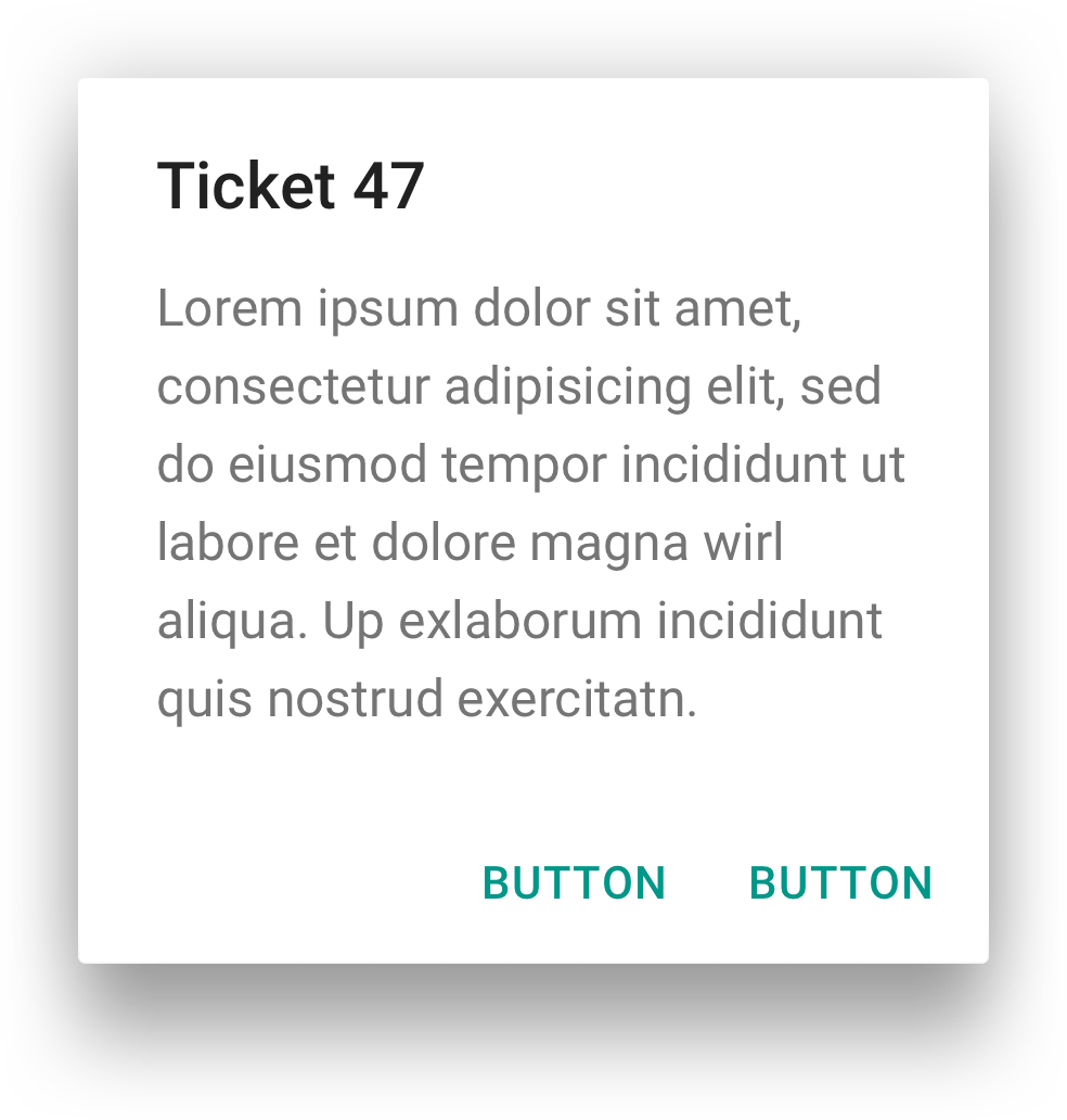
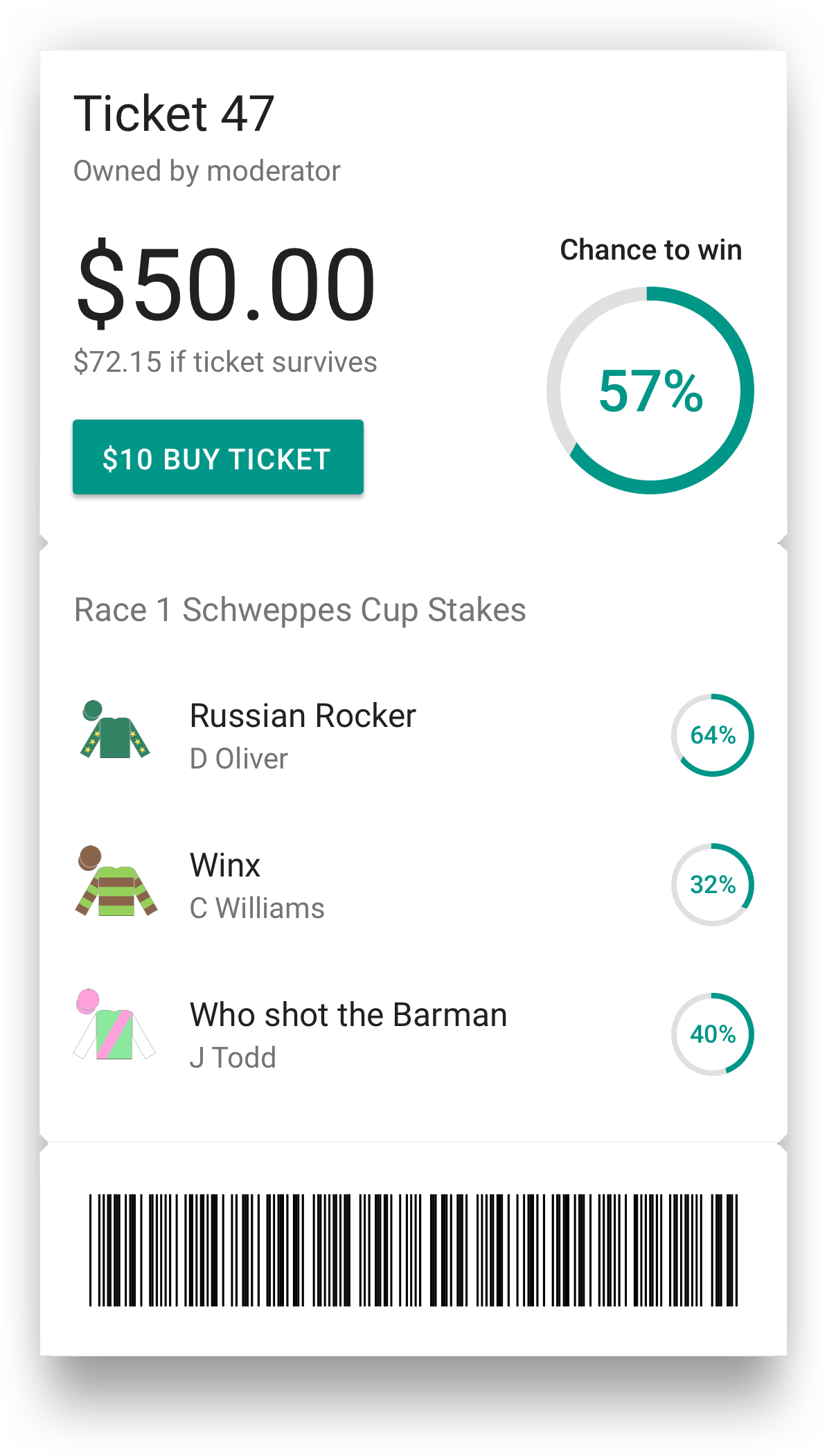
Dialogs
We transformed the Dialog into a Ticket to help visualisation the concept of a Ticket in the game.
Usability Testing
Game Navigation
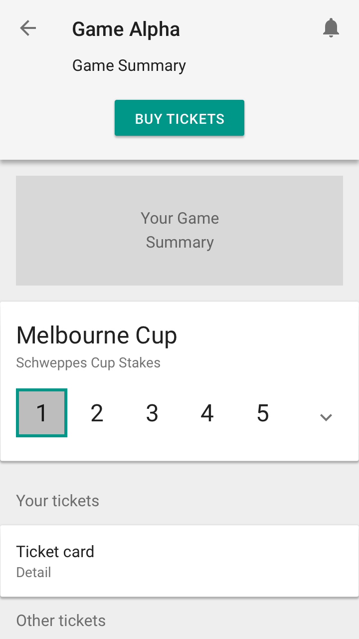
A/B Usabilty Test was conducted with 30 test participants. The goal was to discover metrics about how the prototype performed. One of the key areas was the way users navigated throughout the game. The stakeholders were very keen on navigation 2, using a card with an accordion. The gain their trust and convince them on an alternative option, we conducted a usability test.
User pain points and highlights found throughout the testing session
- Users mainly go to the previous or next event. They rarely go to events beyond
- Users wanted to check what happened in the previous round
- Users wanted to know what the next event is if they make it through
- It's less click and more convinient to use back/forwards arrows

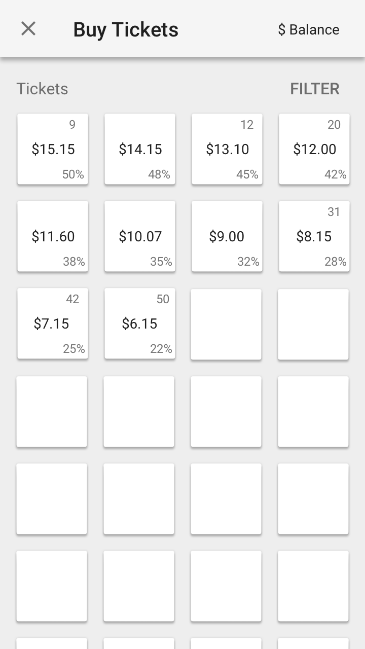
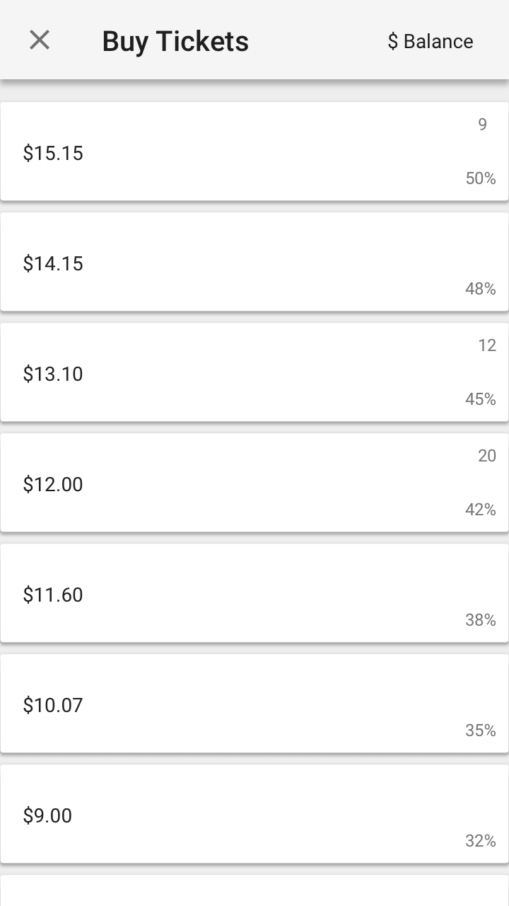
Ticket Display
Usabilty Testing was conducted with 5 test participants. The goal was to discover if the grid or list Ticket display was the most effective.
Findings and highlights found throughout the testing session
- Users just want to see the price, leaderboard position, and percentage chance
- Users like to be able to see more tickets on the screen at once
- Users want filters to help find tickets
After synthesizing the user feedback, we felt like the grid would have the most positive impact on the user’s experience